
Special Properties
Planting roots in the community
Recognized as the top real estate agents in Wisconsin's idyllic Green Lake, Special Properties was ready for branding as distinct as its agency.
 See The Story
The Client
- Special Properties
- Green Lake, WI
What We Delivered
- Art Direction
- Brand and Identity
- Copywriting
- Illustration
- Printed Collateral
- Signage Design
- Web Design
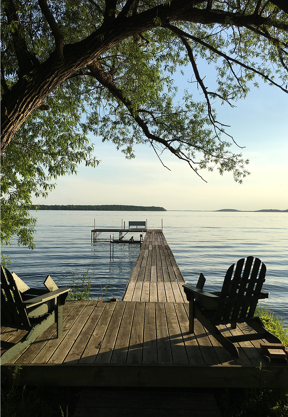
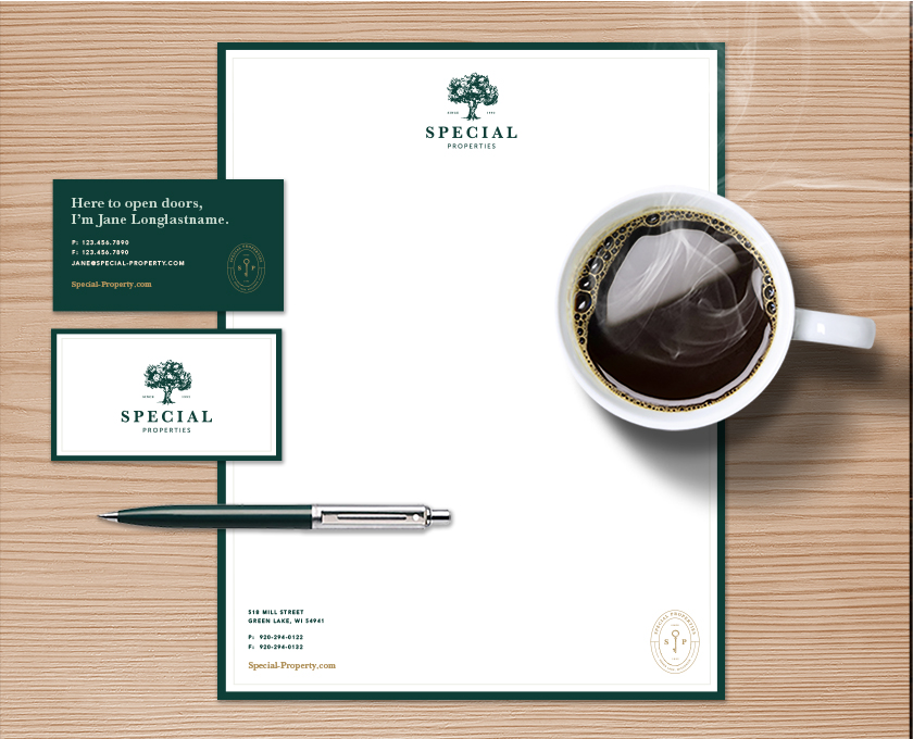
Real estate is a personal thing. We took an authentic and emotional approach to developing a new brand that felt natural and familiar.
Same trusted agents, new look
Special Properties’ logo was a tree, but rather than wiping the slate clean, we took a moment to learn more about its meaning. At the end of the day, we embraced the concept. A fresh take on the classic symbolism was developed by redrawing the tree, exploring new typography and establishing secondary and tertiary marks.
The rebrand is professional and approachable, achieved through a soft and casual palette and traditional typography. The branding is complemented by friendly copywriting throughout a new website, which helped the brand come to life.

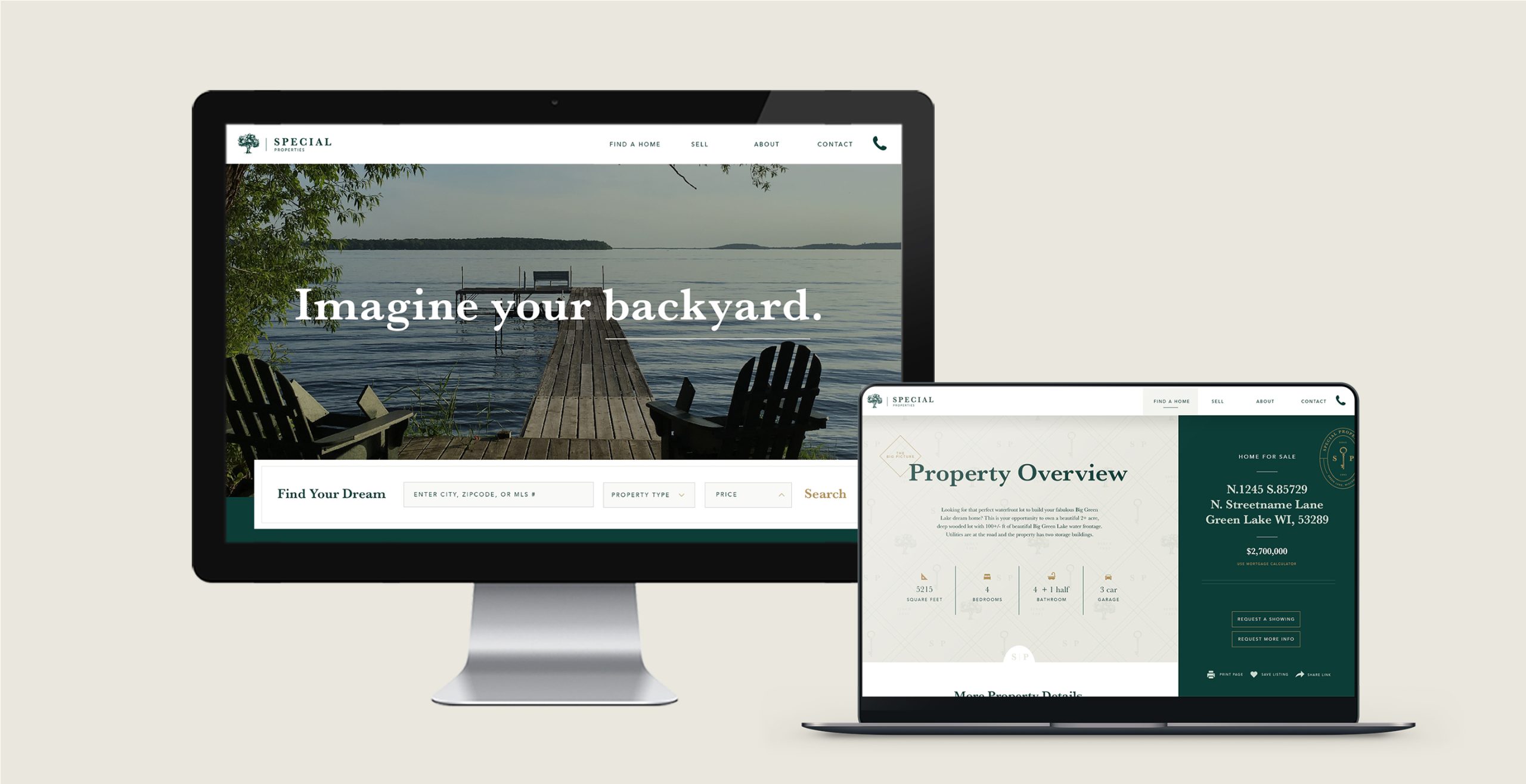

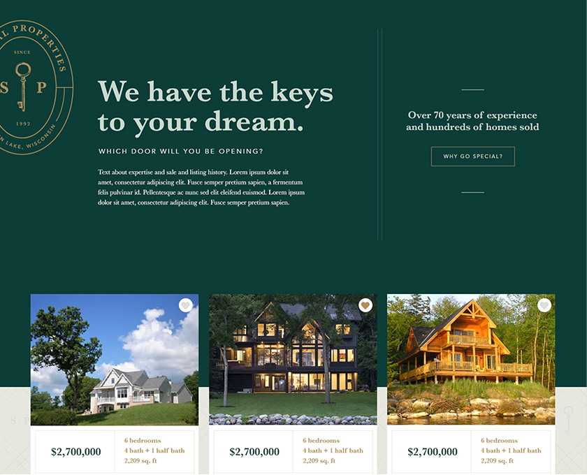
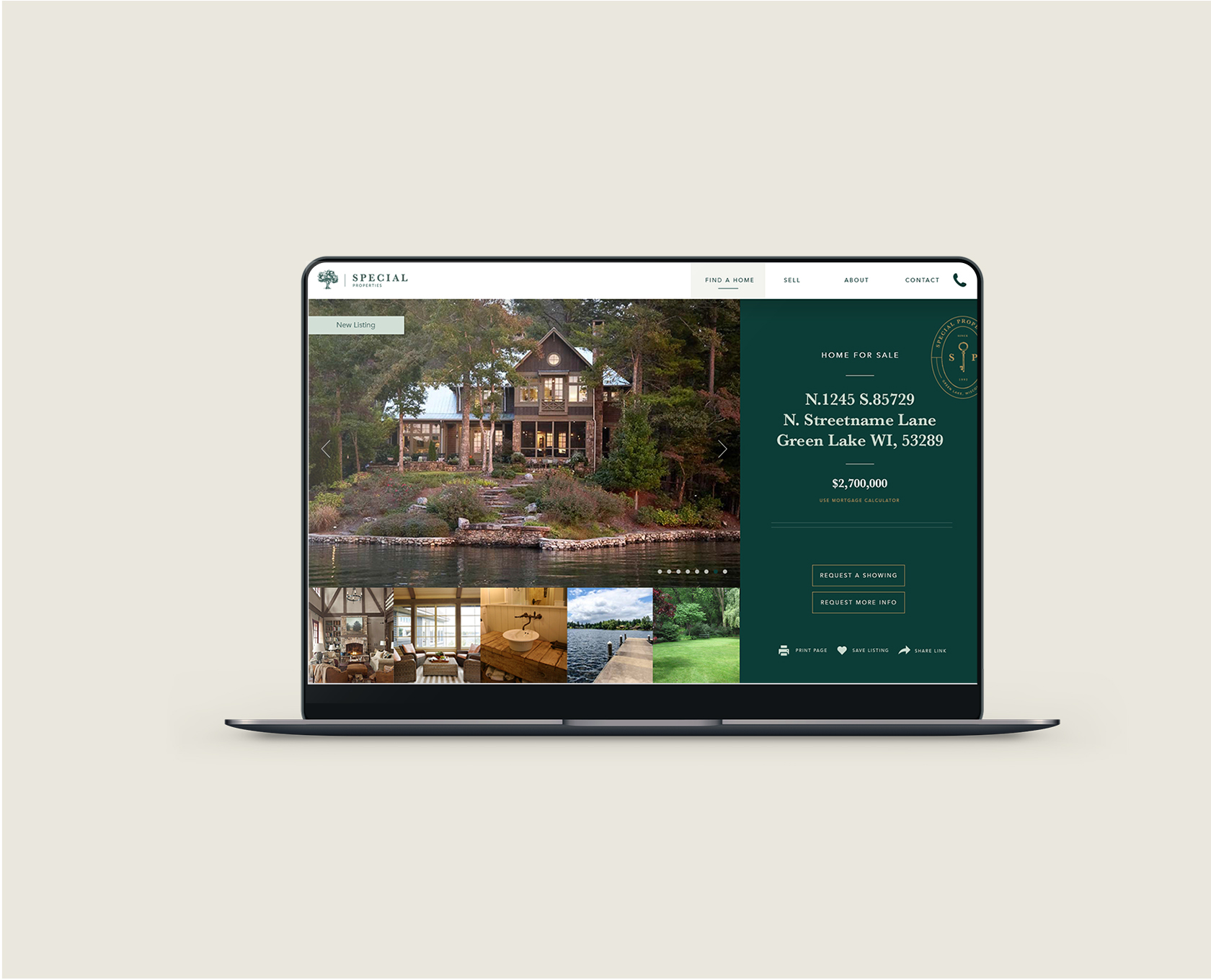
An on-brand and highly functional website
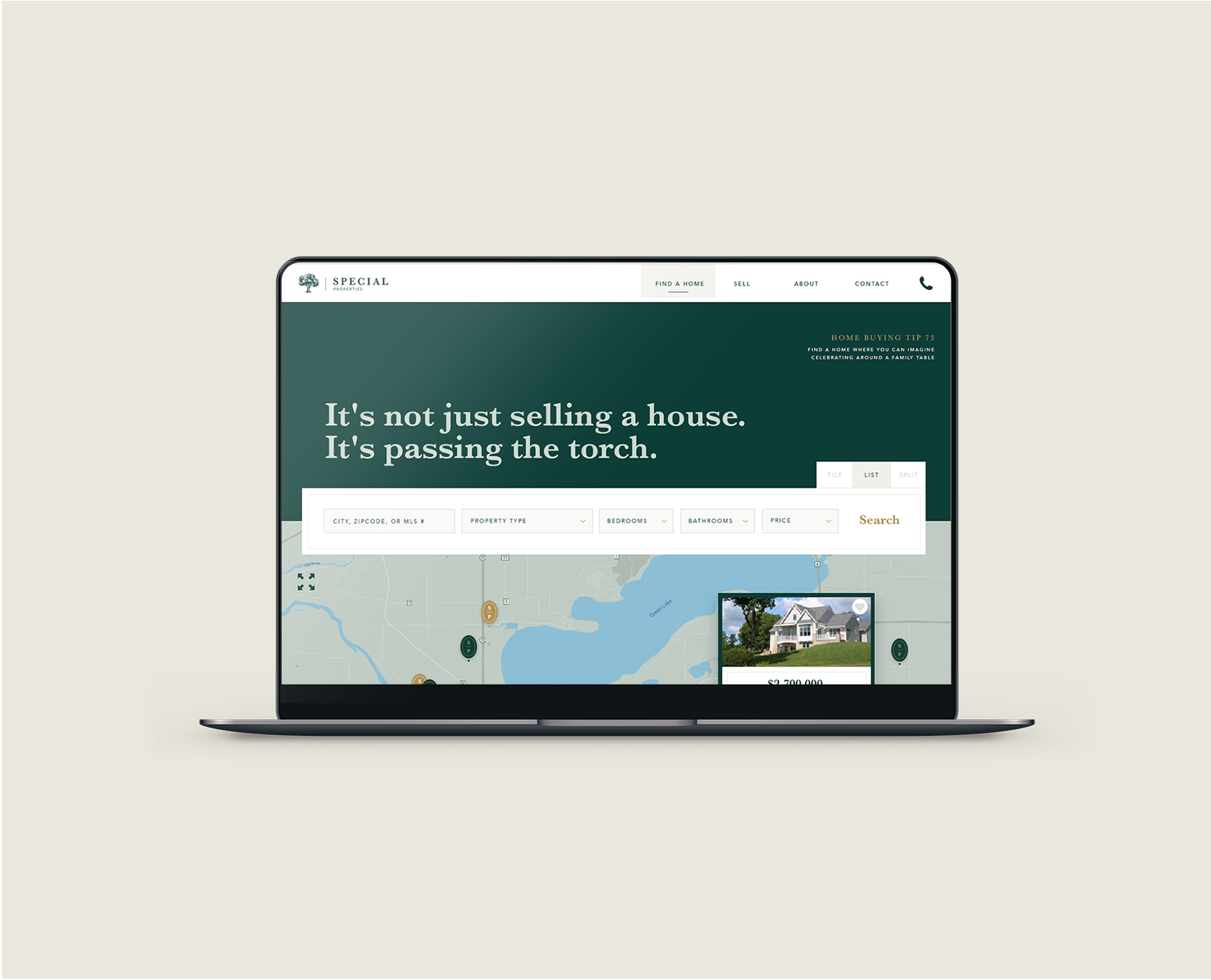
First impressions count, especially in real estate. We were charged with designing a website that reflected the unique personality of the company and team, but also delivered leads. We utilized advanced functionality that interfaced with MLS and developed complex filtering options so visitors to the site could find the listing that was right for them. Also Read Our schlitz park Story.
Turning over the keys
The website needed to be user-friendly for the visitor, but it also needed to have an easy-to-use CMS. Therefore, we created a super customizable back end to the website, giving the client the ability to make quick and easy updates. This robust tool provides the option to choose featured properties, showcase their growing team and communicate what matters most.