Alta Peruvian Lodge
For the Skiers' Skiers
As industry trends evolve and skiers begin to prioritize different aspects of the sport, it was time for a gut check to ensure that the messaging and overall visuals still resonate with their guests. It didn’t - so we fixed it.
 See The Story
The Client
- Alta Hotel Group
- Alta, UT
What We Delivered
- Brand and Identity
- Copywriting
- Illustration
- Printed Collateral
- Web Design
Enhancing an identity
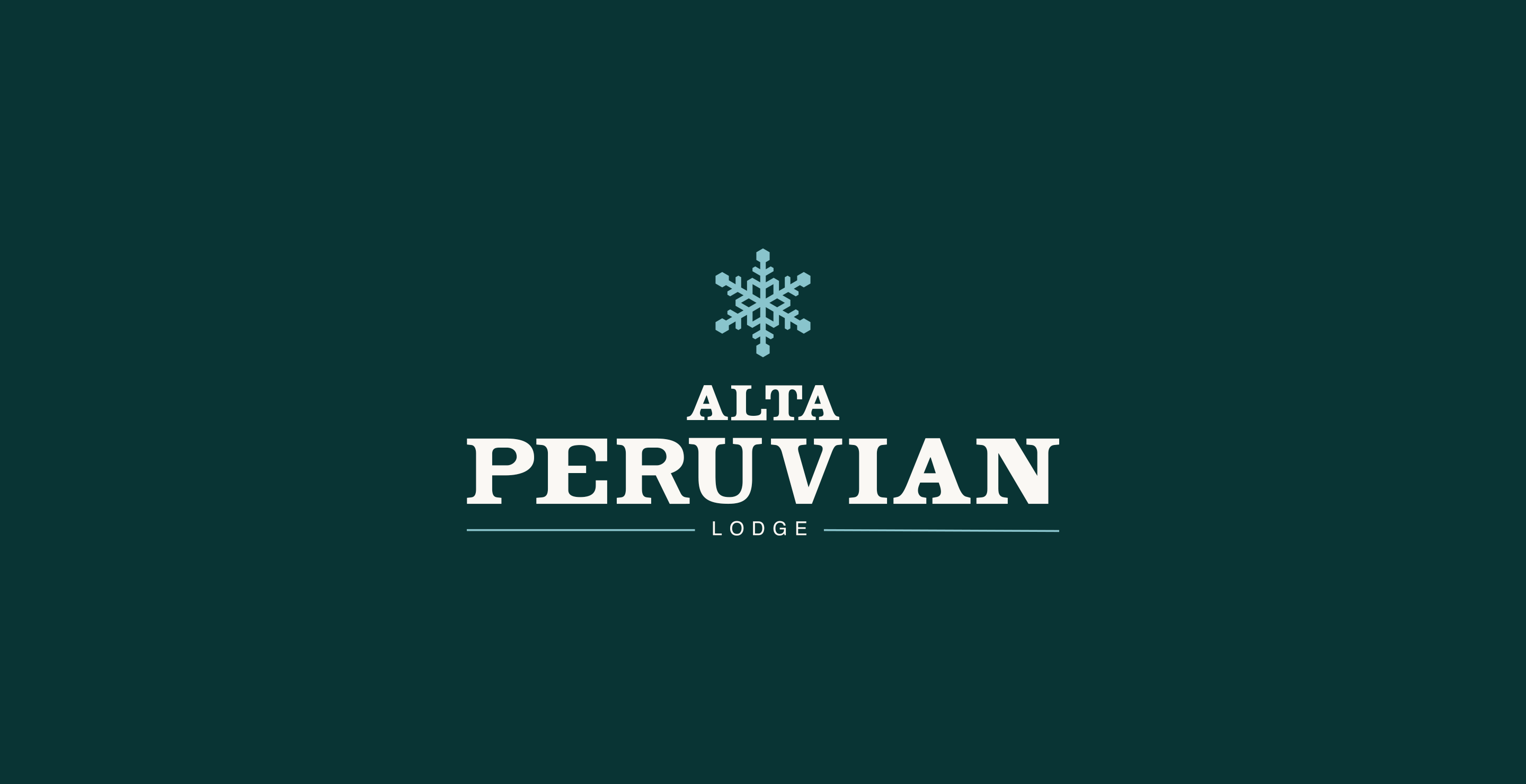
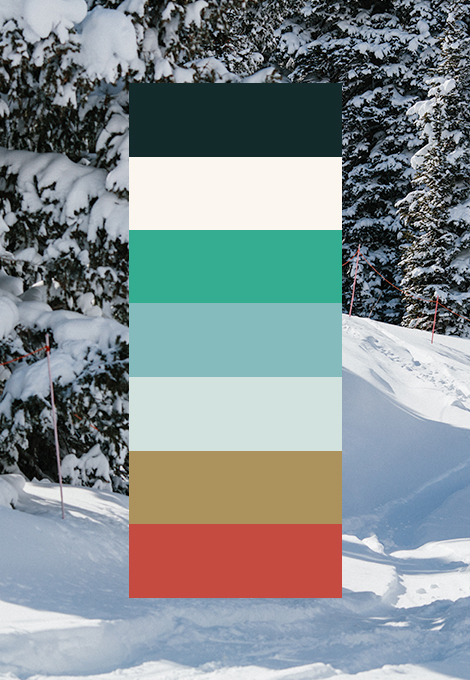
While the logo remained somewhat untouched, our work began with revising the basics of visual identity. The color palette was altered, increasing the contrast to give an “aged” flavor, representing the heritage of Alta and the Peruvian specifically. We also introduced less obstructive fonts and leaned into vintage-inspired typefaces that maintain an elevated feel.
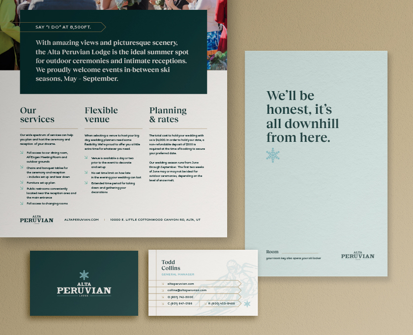
We discovered an art direction that balances the history of the property with modern ski culture.
TO TRULY EMBODY ALTA
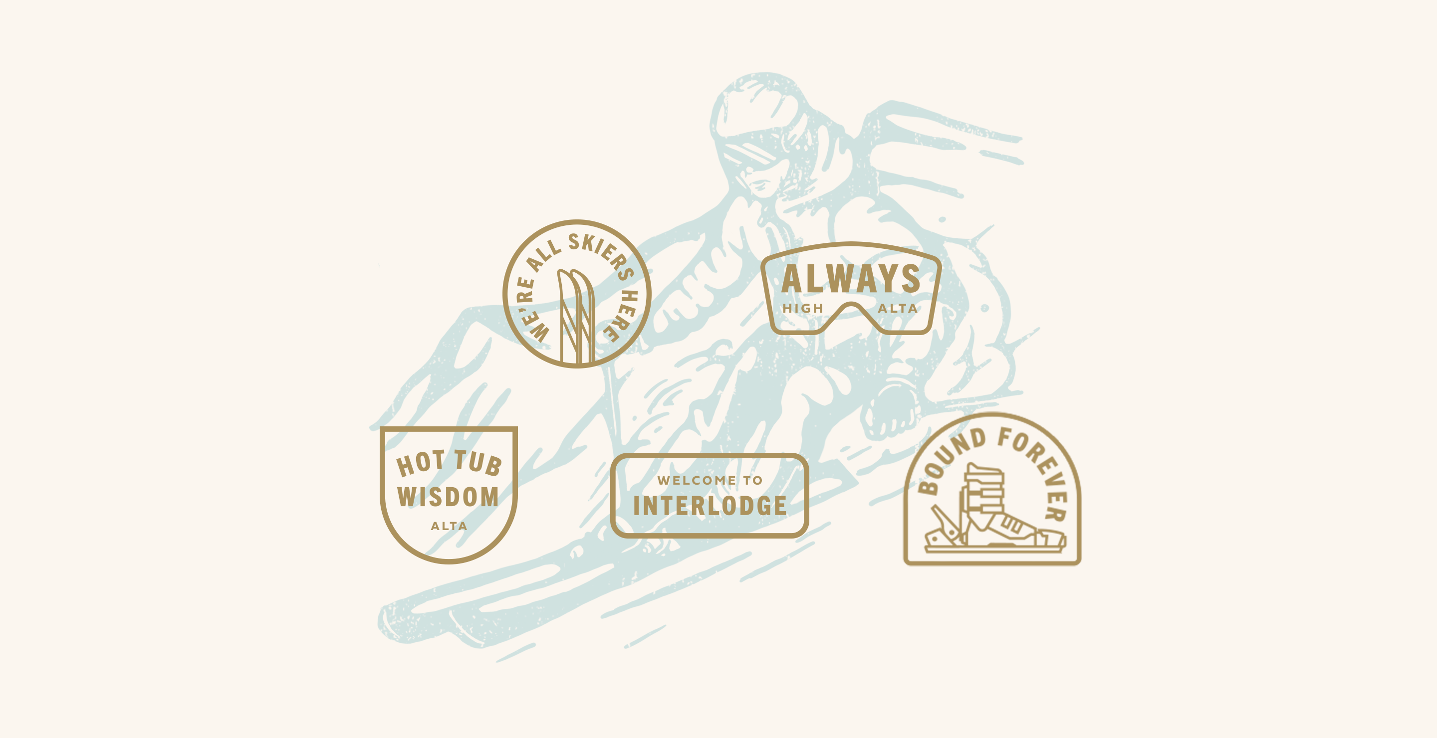
The updated identity is now an exciting tug-of-war between vintage and modern. This is seen most vividly through worn hand-drawn sketches juxtaposed against today’s badge icons. The hand-drawn sketches embody the idea of those who have previously skied Alta, leaving their print in the form of a doodle. The Peruvian-only ski badges pay homage to the modern culture, sprinkling walls and jackets with badges and lift passes from mountains conquered.
(RE)APPLYING THE BRAND
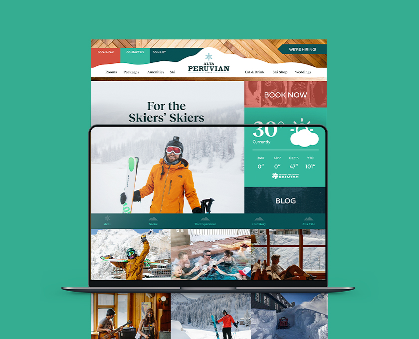
The best part of a rebrand is seeing it come to life. First up, the website. While still promising an authentic Alta experience, we applied the updated elements that can be seen and felt throughout the site. We also refreshed all the graphics used for the lodge’s email and digital marketing campaigns.
For the final touches, we reimagined the collateral package. All the pieces now reflect the vintage-inspired elements and the qualities and values of their guests.
